CENTURY 21 Scheetz - Stacy Barry Team Postcards
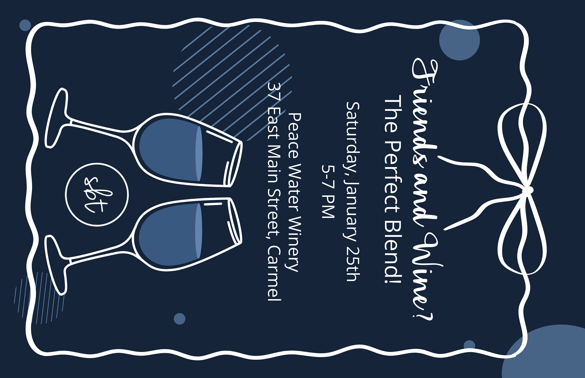
One of the most rewarding graphic design projects I’ve worked on at CENTURY 21 Scheetz has been collaborating with Stacy Barry and her team on custom monthly mailers for her sphere. Stacy is an incredibly successful agent whose mailers needed to stand out while incorporating hyper-local elements to connect with her clients. These campaigns required creative brainstorming, thoughtful strategy, and an eye for detail to ensure each piece not only represented Stacy’s brand but also resonated with her audience.
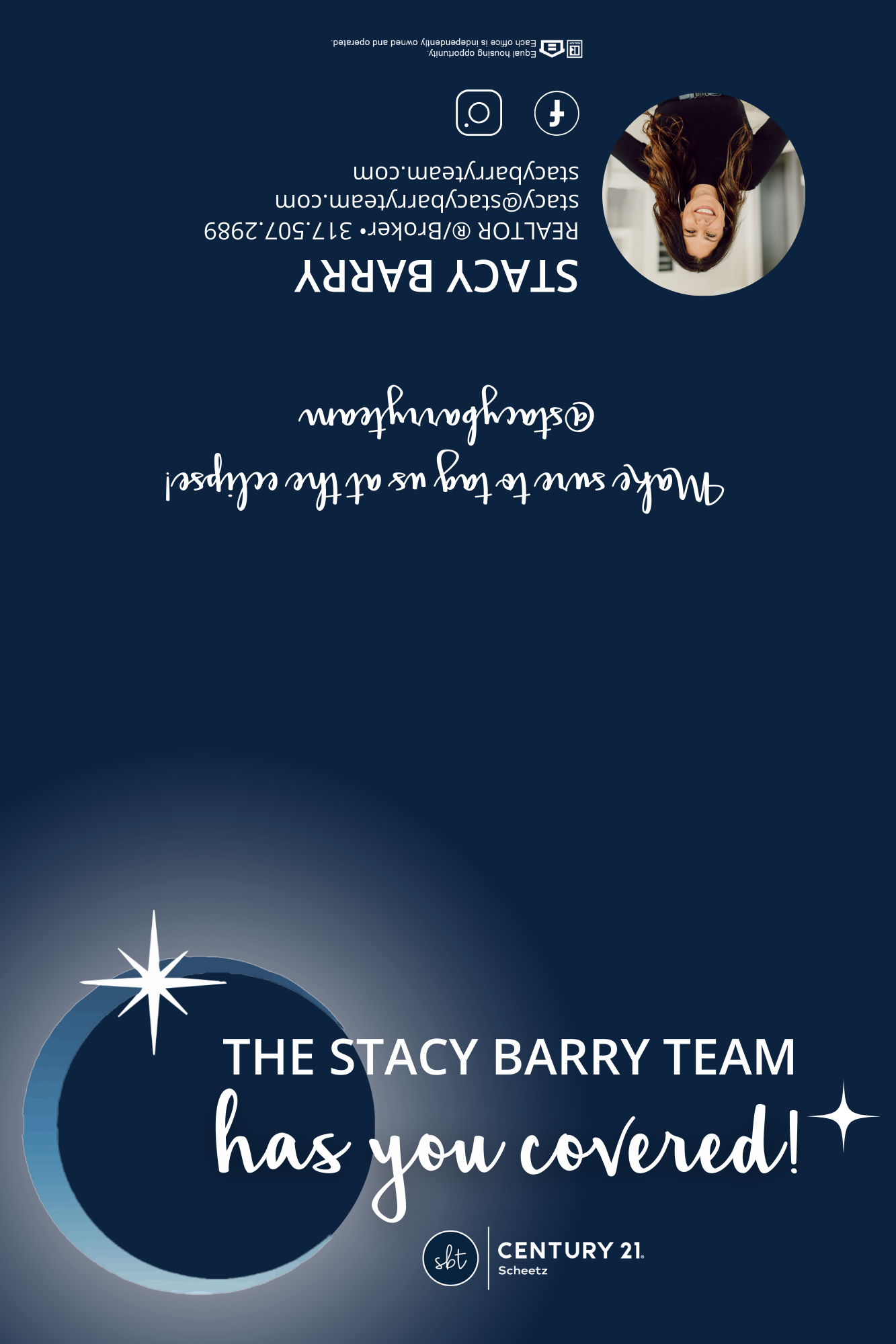
Before each month, Stacy and I would meet to brainstorm ideas and develop a strategy for the mailer’s theme and engagement components. For example, when the Eclipse occurred last April, Stacy wanted to create a special mailer with the tagline, “The Stacy Barry Team has you covered!” The mailer not only featured eclipse-themed visuals but also included custom eclipse glasses for her clients. Since our typical mailers aren’t designed to hold objects, we reformatted the design into a foldable piece that accommodated the glasses while maintaining a polished and professional look.
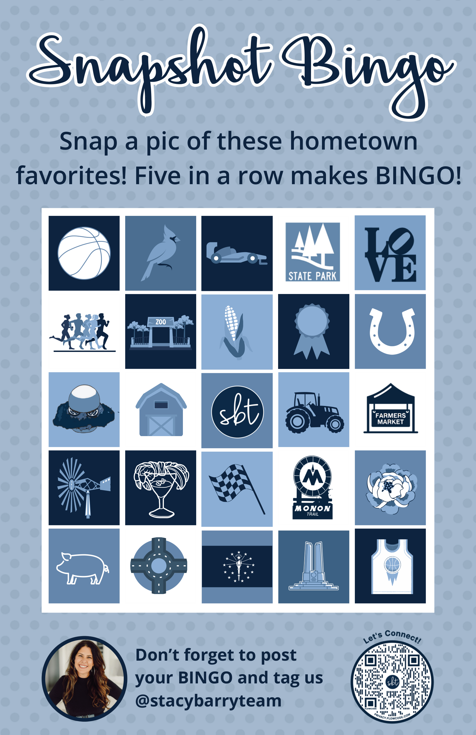
Another standout project was the May mailer, centered around the Indy 500. We created an interactive bingo board filled with custom vectors representing iconic Indiana symbols, such as the Indianapolis Colts horseshoe, a race flag, and a cardinal. The call-to-action encouraged recipients to take pictures of these places or symbols and tag Stacy’s social media accounts, turning the mailer into a fun engagement opportunity that also boosted her online presence.
Designing these mailers required both strategy and technical skills. I used Adobe Illustrator to source and customize vectors, ensuring they matched Stacy’s signature blue and her overall branding. The final designs were pieced together in Adobe InDesign and Canva, where I adjusted layouts, incorporated her logo, and ensured the visuals were eye-catching and cohesive. Some projects, like the eclipse mailer, required unique formatting and materials, such as foldable layouts and specialized print specifications, which I managed to bring her vision to life.
CENTURY 21 Scheetz - 2024 Monthly Mailers
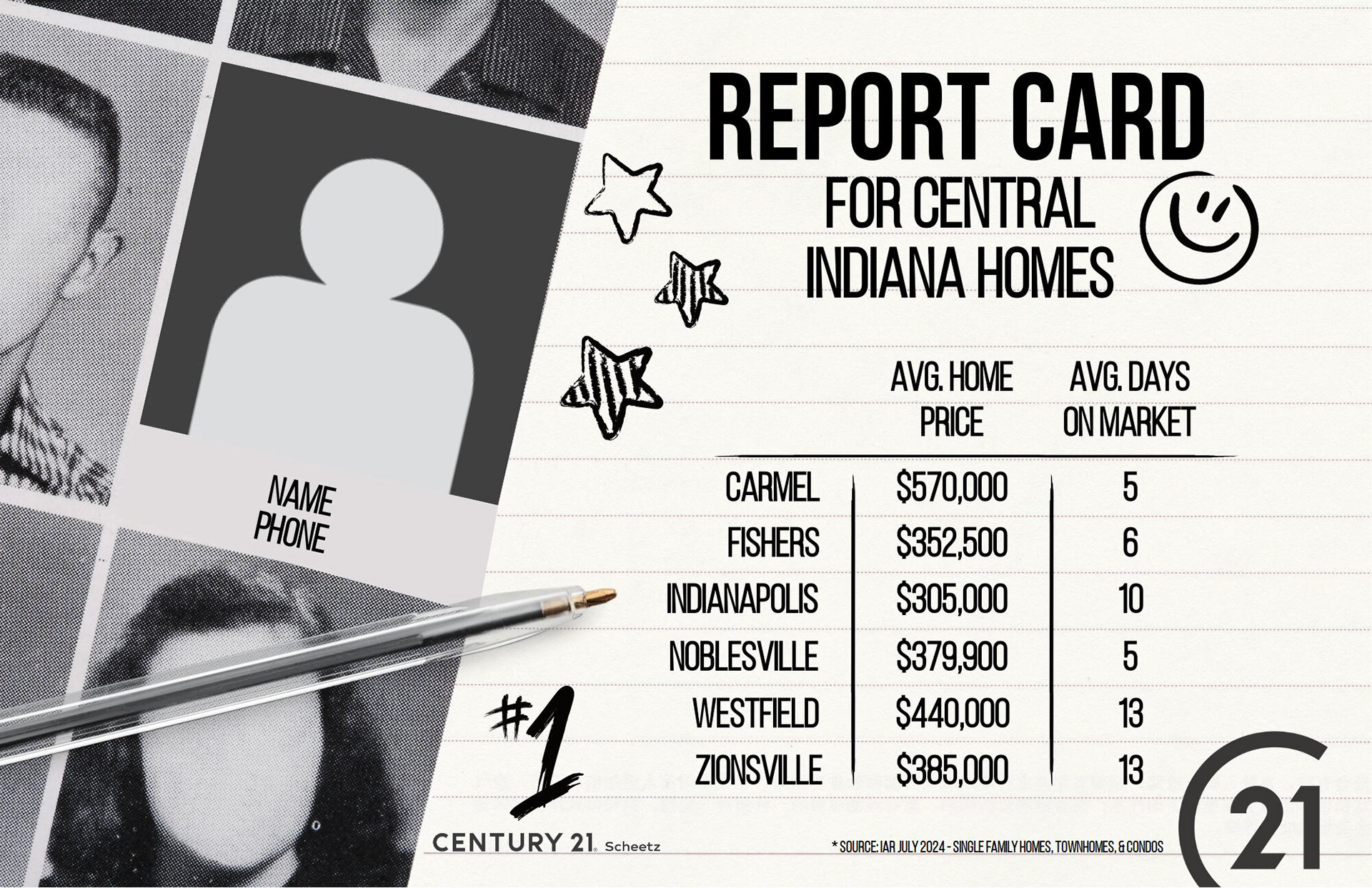
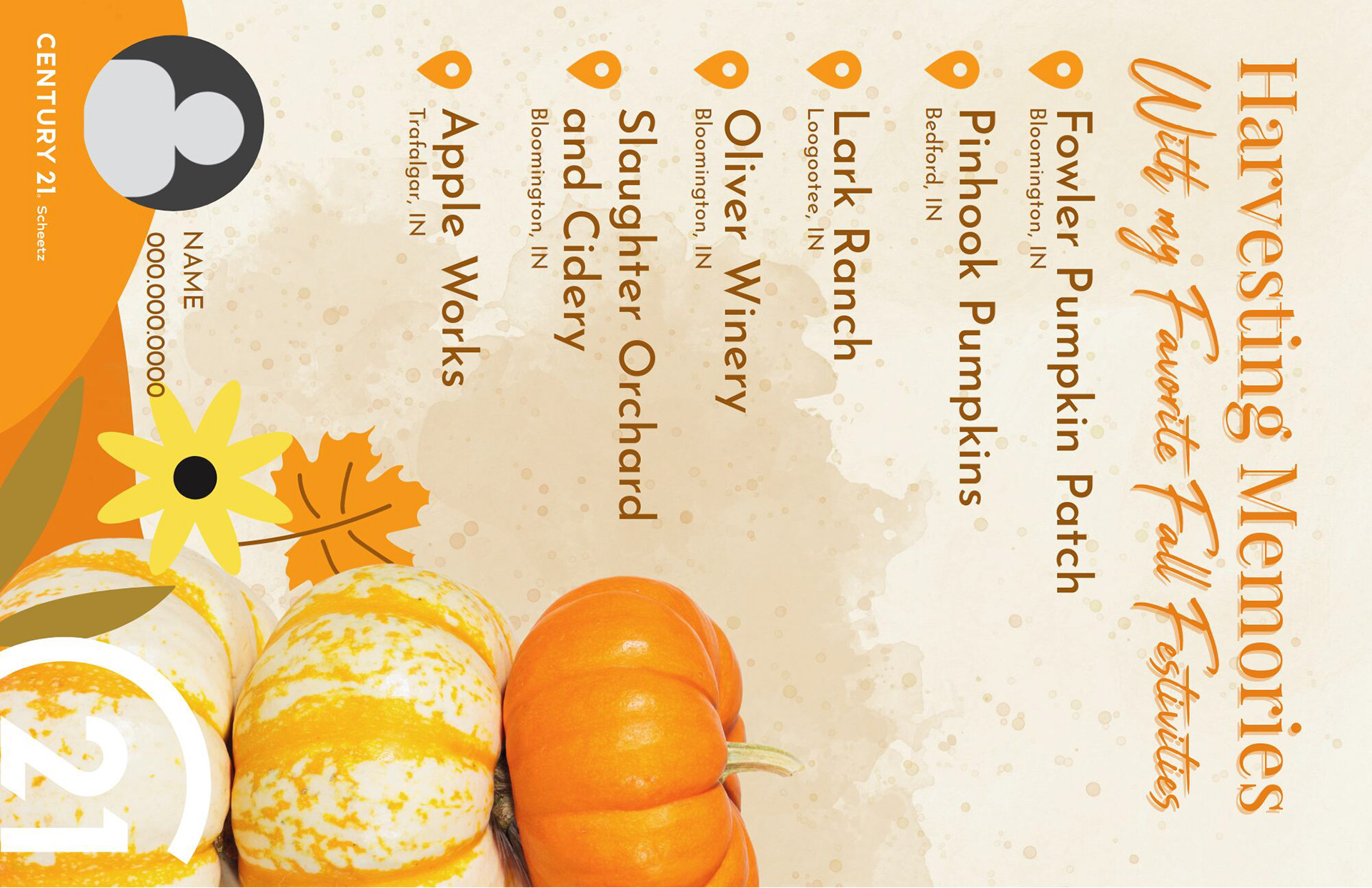
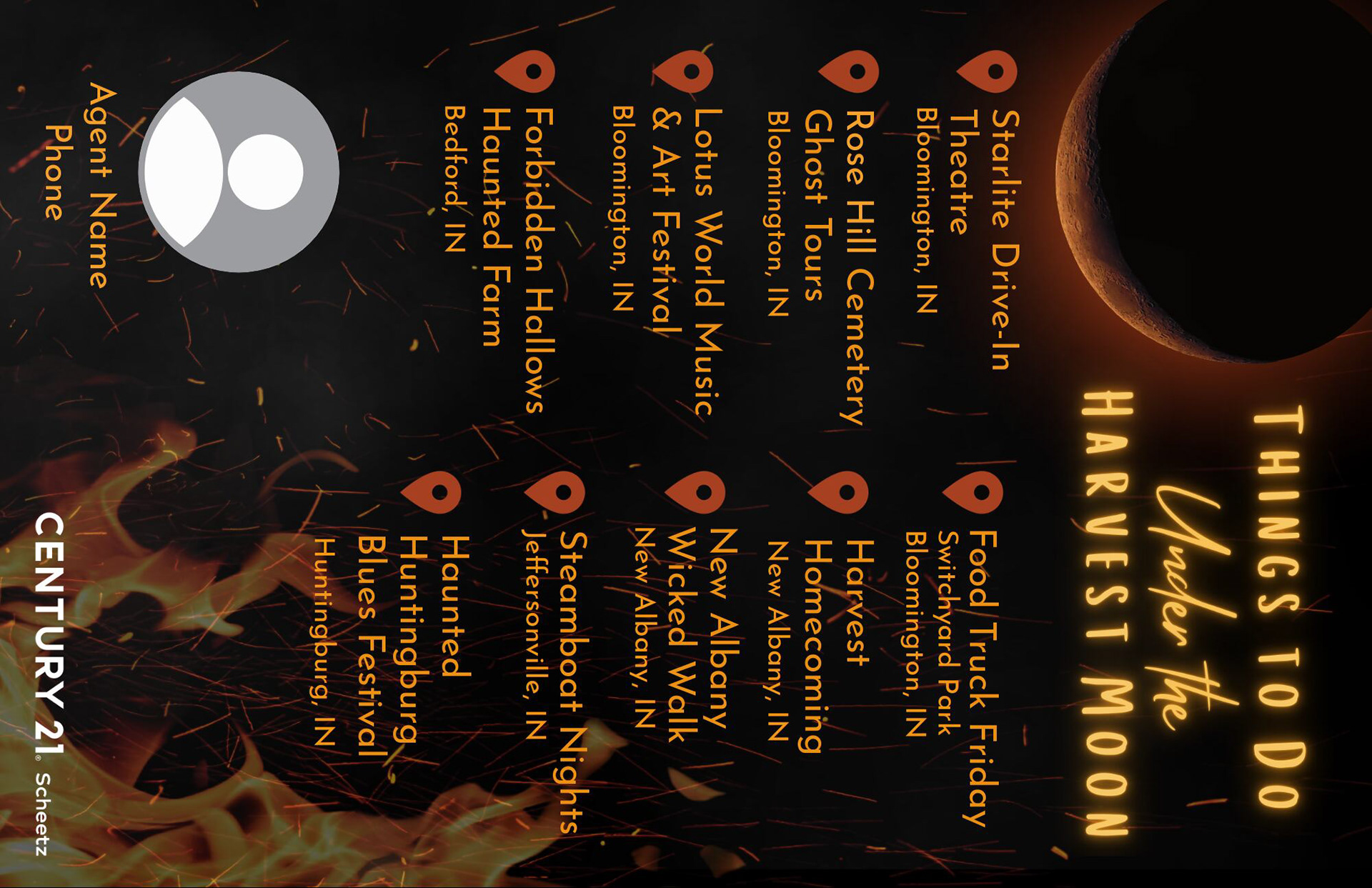
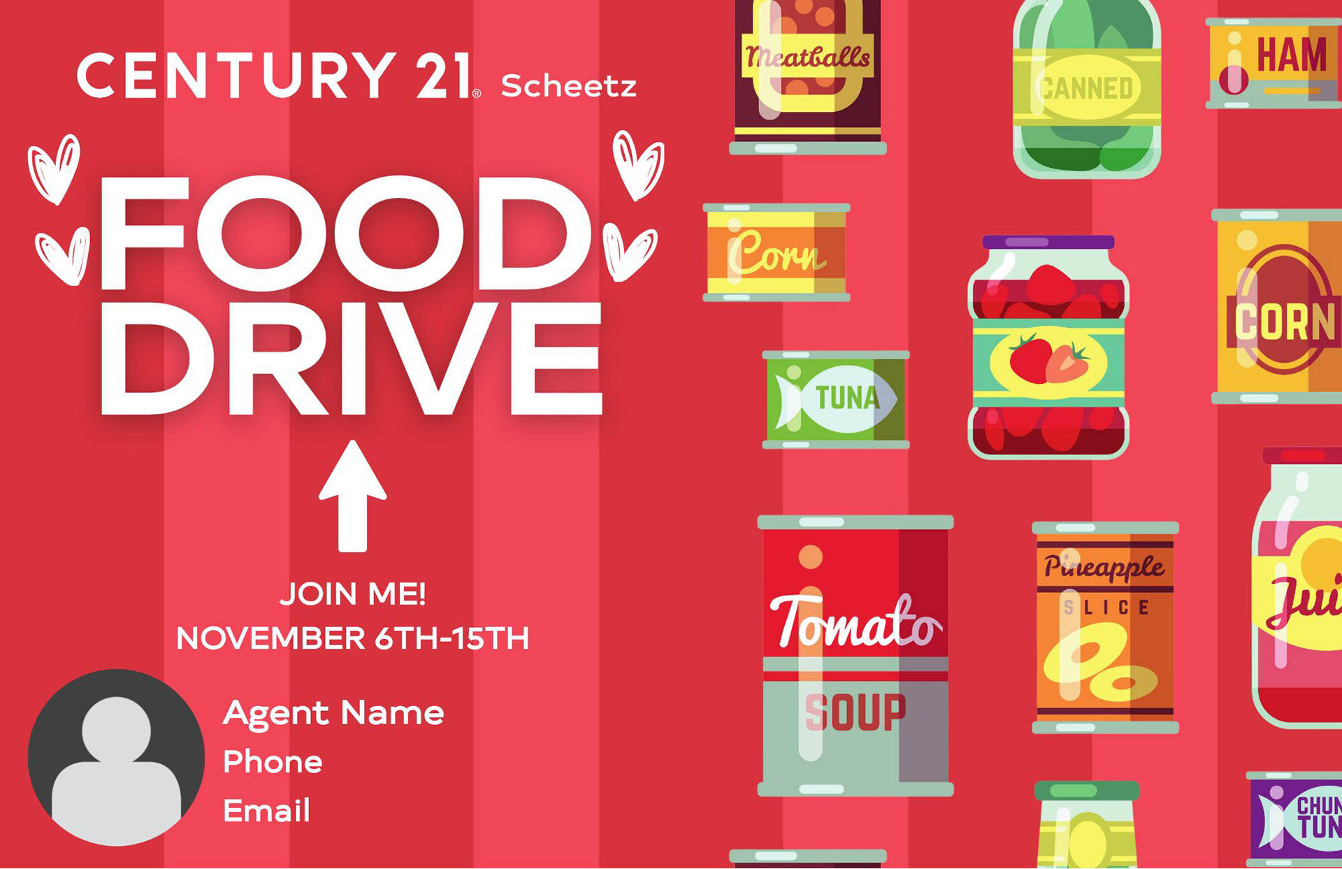
Designing monthly mailers for CENTURY 21 Scheetz agents has been one of the most creative and impactful projects I’ve worked on. Each month, we send out a postcard to our agents’ spheres, highlighting a topic tied to local events or holidays. In October 2023, our team met to plan the topics for the entire year, dividing the months among us to ensure every design was unique and engaging. I was tasked with creating four mailers—July (Indiana State Fair), September (Homecoming), October (Fall Activities), and November (Shop Local). With a tight timeline to have these ready by December, this was a significant project that required both creativity and efficiency.
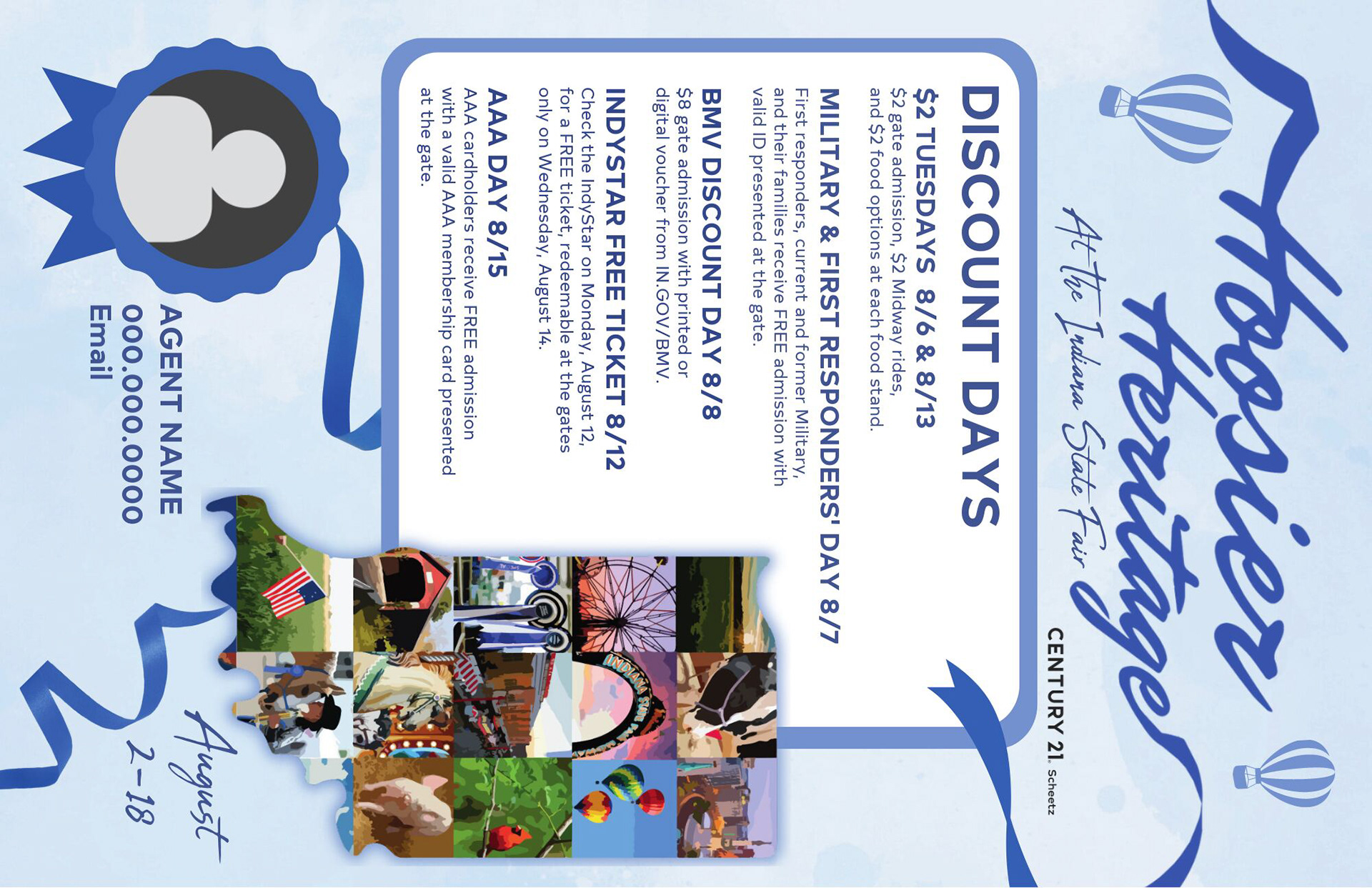
For July, I wanted to celebrate the Indiana State Fair in a way that reflected Hoosier pride. I created a vector of the state of Indiana filled with stock images representing the fair—think corn dogs, Ferris wheels, and livestock. Using Adobe Illustrator, I gave these images an oil painting effect, adding texture and warmth to the design. The goal was to convey a sense of nostalgia and love for our state while creating a visually stunning piece that stood out.
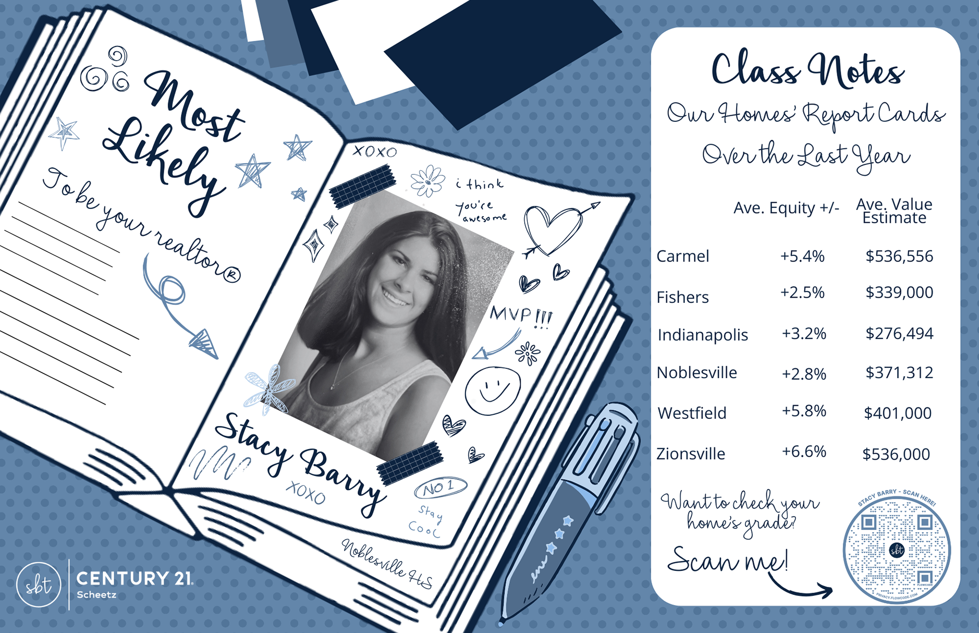
September’s theme of Homecoming allowed for a fun and nostalgic approach. I designed the mailer to resemble a vintage yearbook, complete with a “class photo” feel. Agents were invited to submit their high school pictures, which were then incorporated into the design. This personal touch not only delighted their spheres but also showcased their personalities in a relatable and endearing way. Formatting this piece to look like an authentic yearbook page took time, but the final product was worth the effort.
For October, I designed two separate mailers to cater to different audiences. While pumpkin patch mailers are a staple, I recognized that not all spheres consist of young families. One mailer highlighted daytime fall activities around Central Indiana, like corn mazes and festivals, while the other focused on adult-oriented events, such as haunted hayrides and spooky attractions. This dual approach ensured the mailers resonated with a broader audience and provided more value to agents and their clients.
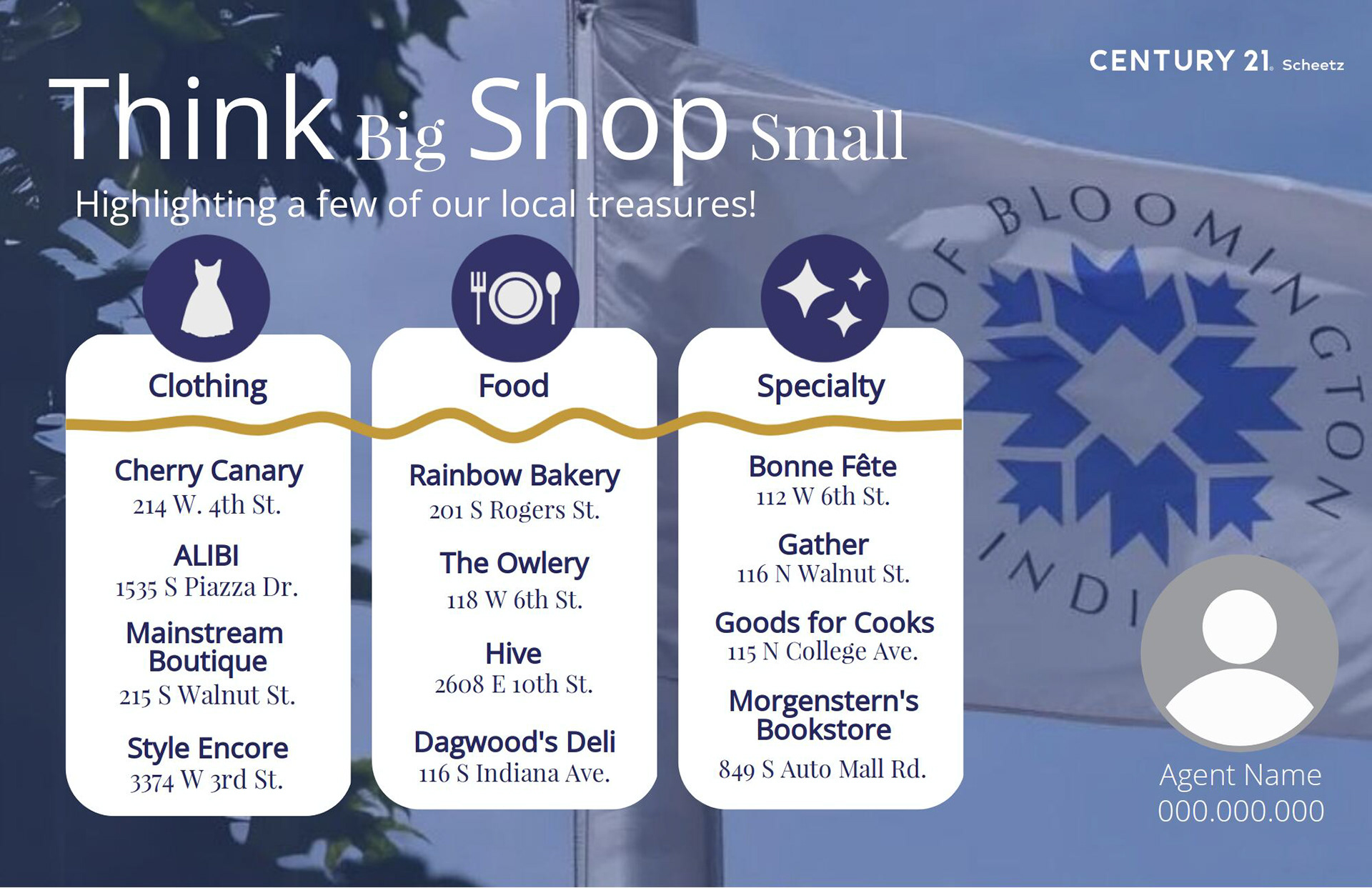
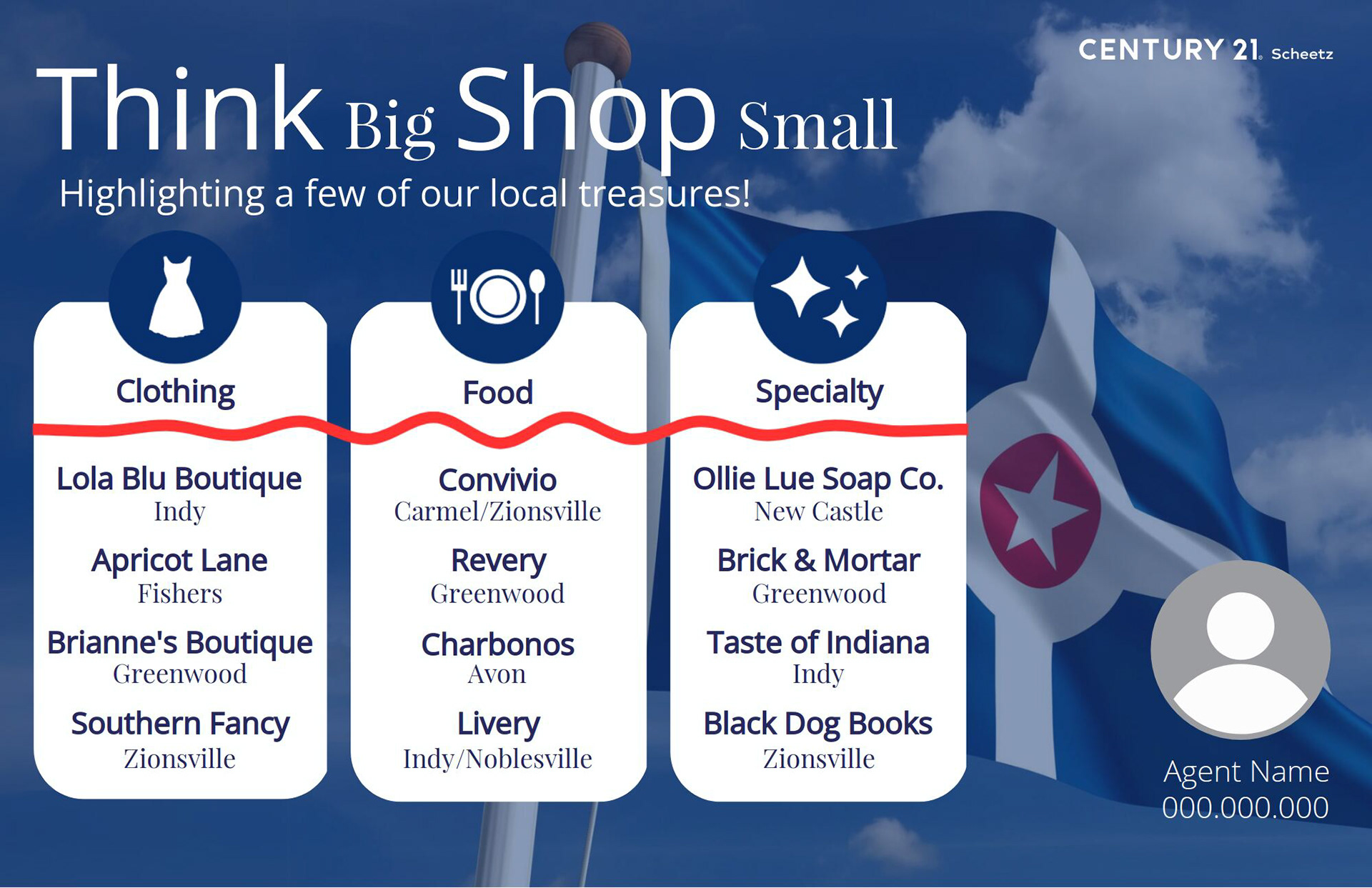
In November, we celebrated Small Business Saturday with another dual mailer approach. I emphasized that REALTORS® are small business owners, directly benefiting their communities. The postcard highlighted the importance of supporting local small businesses while also listing some of our favorite businesses in the area. To further tailor the mailers to specific regions, I created two versions: one for Central Indiana and one for Bloomington. By incorporating the Indiana State Flag and the Bloomington City Flag into the designs, the mailers connected deeply with the communities our agents serve.
CENTURY 21 Scheetz - Logo Design
At CENTURY 21 Scheetz, we offer agents the opportunity to create custom branding, including logo design, social media marks, email signatures, and business cards. These projects are highly personalized, starting with agents completing a Branding Questionnaire. This allows us to understand their preferences, style, and vision. Afterward, we meet with them to discuss their likes and dislikes in greater detail to ensure the final designs align with their goals and branding needs.
Once the initial consultation is complete, I begin the creative process by gathering inspiration. I often browse sites like Pinterest for design ideas and use Getty to explore vector images that connect with the agent’s vision. Using tools like Adobe Illustrator and Adobe InDesign, I craft three unique logo options for the agent to review. Each design incorporates elements tailored to the agent’s preferences, including colors, icons, and typography.
Fonts play a crucial role in creating a polished and professional design. To ensure licensing compliance, I exclusively use open-source fonts, often sourcing them from Google Fonts. These fonts provide versatility while maintaining the clean and modern aesthetic that our agents look for. The entire process, from brainstorming to design, involves meticulous attention to detail to ensure the logo reflects the agent’s personality and brand.
Once the initial designs are complete, I present the three logo options to the agent, allowing them to choose their favorite and provide feedback. Based on their input, I make revisions to finalize the design. This collaborative approach ensures the agent feels fully connected to their new branding.
